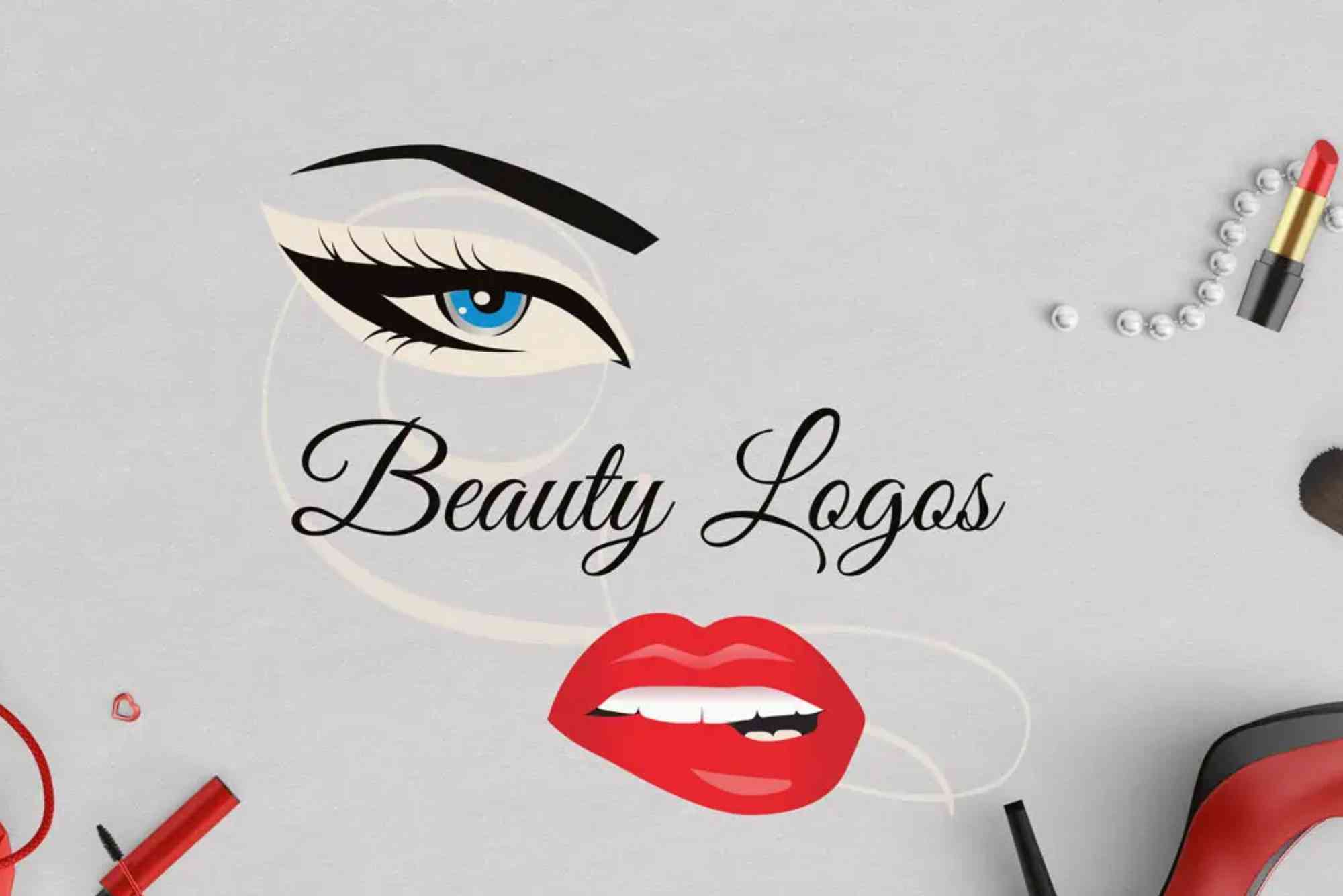
10 Best Beauty Logos and What Makes Them Memorable
In today’s visually driven world, a brand’s logo speaks volumes before a single word is read. In the beauty industry, where aesthetics and emotion reign supreme, a well-designed logo is more than just an icon—it’s the face of the brand. From luxury skincare giants to indie cosmetic startups, the best beauty logos blend simplicity, symbolism, and storytelling to leave a lasting impression. But what makes a beauty logo truly memorable?
Let’s explore the key elements that set these logos apart and why they continue to inspire admiration across the globe.
The Importance of a Logo in the Beauty Industry
The beauty market thrives on perception. Consumers are influenced not just by product performance but also by the emotional connections they form with a brand. A logo serves as a visual shortcut to those feelings. In an industry saturated with competition, a memorable logo helps brands establish identity, communicate values, and stand out from the crowd.
What Makes the Best Beauty Logos Stand Out?
Creating an unforgettable beauty logo is both an art and a science. These are the common traits that the best beauty logos share:
Simplicity and Elegance
The most effective beauty logos often rely on clean lines, minimalist designs, and timeless fonts. Simplicity allows the logo to be versatile across different mediums—from lipstick tubes to website headers.
Strategic Use of Color
Color psychology plays a major role in logo design. Soft pastels suggest calm and femininity, while bold colors like red or black exude power and sophistication.
Typography That Tells a Story
Fonts can be powerful. Serif fonts may suggest heritage and luxury, while sans-serif fonts can appear modern and approachable. Many beauty brands blend typography with custom elements to build a unique identity.
Versatility and Scalability
The logo must look great on everything from a tiny product label to a massive billboard. Top beauty logos retain clarity and impact at any size.
Emotional Connection
Whether it’s through symbolism, storytelling, or sheer aesthetic appeal, a beauty logo should evoke emotion. That emotional response is what embeds it into memory.
Exploring the Top 10 Best Beauty Logos
Without relying on a numbered list, let’s take a deep dive into ten iconic beauty brand logos that perfectly balance design and branding success.
The Chanel logo stands as a timeless emblem of luxury. Its interlocking C’s are simple yet distinctive, instantly recognizable across the globe. It uses monochromatic black and white, emphasizing elegance and sophistication. Its strength lies in symmetry and minimalism—a design so strong it needs no words.
Next is Glossier, a modern beauty brand that appeals to younger audiences through a minimalist and contemporary aesthetic. The “G” is stylized but remains readable, and the wordmark uses soft lowercase fonts, exuding approachability and simplicity. Glossier’s logo reflects its philosophy: skincare and makeup that feels effortless.
Fenty Beauty, launched by Rihanna, has a logo that blends edge with elegance. The brand uses a bold serif typeface that feels grounded yet modern. Its visual identity is inclusive, bold, and fashion-forward—just like its product offerings. The logo doesn’t scream beauty in the traditional sense but still feels chic and fresh.
The MAC Cosmetics logo uses bold uppercase letters with slightly rounded edges. Its strength lies in its clarity and adaptability. The logo works equally well on minimalist product packaging or vibrant campaign visuals. It exudes confidence, professional quality, and high-end makeup artistry.
Estée Lauder opts for a refined serif font with a touch of flourish. The brand’s logo conveys legacy and sophistication, reflecting its position as a heritage beauty brand. Its elegance and restrained use of space reflect the brand’s dedication to quality and class.
The Ordinary uses ultra-minimalist typography in a black-and-white palette. The name itself breaks convention, and the logo reinforces that ethos. With clean lines and sans-serif font, it embodies transparency, honesty, and scientific credibility—ideal for a skincare-first brand.
L’Oréal Paris makes clever use of both uppercase and lowercase letters to create a visual balance. The accent on the “é” is an unmistakable nod to its French heritage, which boosts its aspirational appeal. The logo successfully bridges the gap between mass-market accessibility and luxury vibes.
Kylie Cosmetics, despite being a newer player, has a logo that’s instantly recognizable. Often paired with lip-drip motifs or bold fonts, the logo encapsulates the brand’s youthful, trendy, and playful energy. It resonates with social media-savvy consumers who value personality and flair.
Dior Beauty, another extension of a fashion powerhouse, keeps it classic. The serif font, wide spacing, and sharp lettering all scream luxury. Its strength lies in not trying to do too much—just like the brand’s sophisticated packaging and marketing.
Finally, Rare Beauty, launched by Selena Gomez, features a gentle, humanist sans-serif font in muted tones. It aligns with the brand’s mission of self-expression and mental health awareness. The logo feels soft, approachable, and deeply intentional, making it both memorable and emotionally resonant.
Key Lessons from the Best Beauty Logos
Understanding what makes these logos work can help entrepreneurs and designers craft memorable brand identities of their own.
Brand Consistency Matters
A great logo is only one piece of the branding puzzle. The surrounding elements—packaging, website design, marketing tone—must align with the logo’s style and message.
Know Your Audience
Whether you’re targeting Gen Z, millennials, or luxury clientele, your logo must reflect their values and aesthetic preferences.
Keep It Timeless
Trendy designs may capture attention, but timeless designs ensure longevity. A logo should evolve with the brand but never feel outdated.
Evoke Emotion, Not Just Aesthetics
Consumers often choose beauty products based on how a brand makes them feel. If your logo sparks confidence, comfort, or curiosity, it’s doing its job.
FAQs
What should a beauty logo include?
A beauty logo should include elements that reflect your brand’s identity—such as relevant colors, clean typography, and an emotional tone. Avoid clutter and focus on simplicity.
How do I design a logo for a beauty brand?
Start with your brand’s core values and target audience. Choose a color palette and font that reflect your message. Consider hiring a designer or using design tools like Canva or Adobe Illustrator.
What are some good colors for beauty logos?
Soft pinks, beige, pastels, black, and gold are commonly used in beauty logos. These colors evoke feelings of elegance, calmness, and sophistication.
Why is logo design important in the beauty industry?
Beauty is a highly visual industry. A strong logo helps build brand identity, consumer trust, and recognition. It’s often the first impression you make.
Can I use symbols in a beauty logo?
Yes, but use them purposefully. Symbols like flowers, faces, or abstract forms can work if they align with your brand story and remain simple.